REI Email Marketing
Fashion and function meet the Great Outdoors. Over 3 years of email design for this adventurous brand.

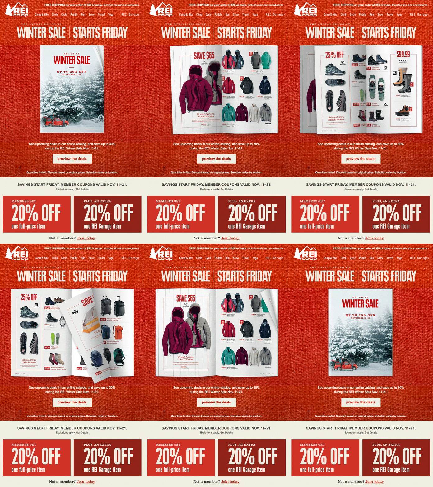
For every big sale we create a preview email that gives a sneak peak at the catalog and introduces the user to the styles and expectations of the campaign. For the 2016 Winter Sale preview I created an animated flip-through of some of the key deals of the season, spread out on the campaign’s red canvas and feature the signature photo for the sale. The resulting send prompted an REI exec to send us a message that began, “THIS IS SO COOL!!!”

Whoo-hoo-hoooooo! Look out below!
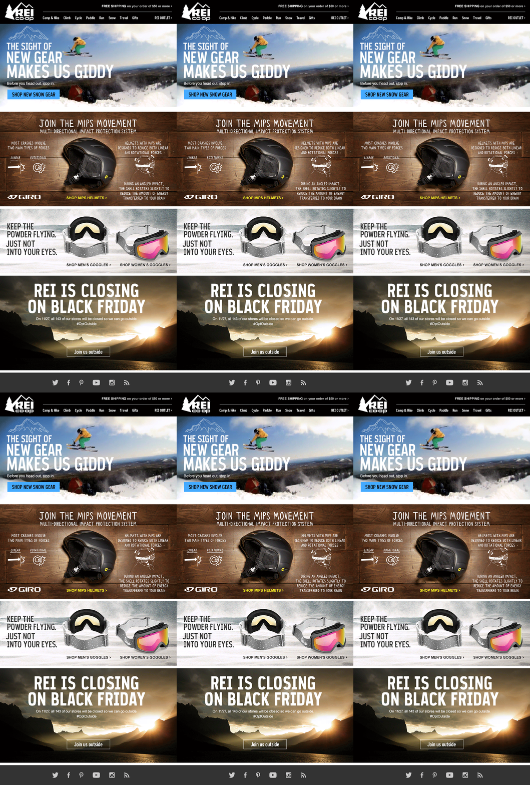
This 3D animated gif made for a new email marketing experience. It captured the spirit of the season and made you feel ready to hit the slopes with some new gear.

When REI updated their site design, I designed the email to announce it. The laptop became a window to a lush vision of nature, illustrating that REI is a portal to adventure.

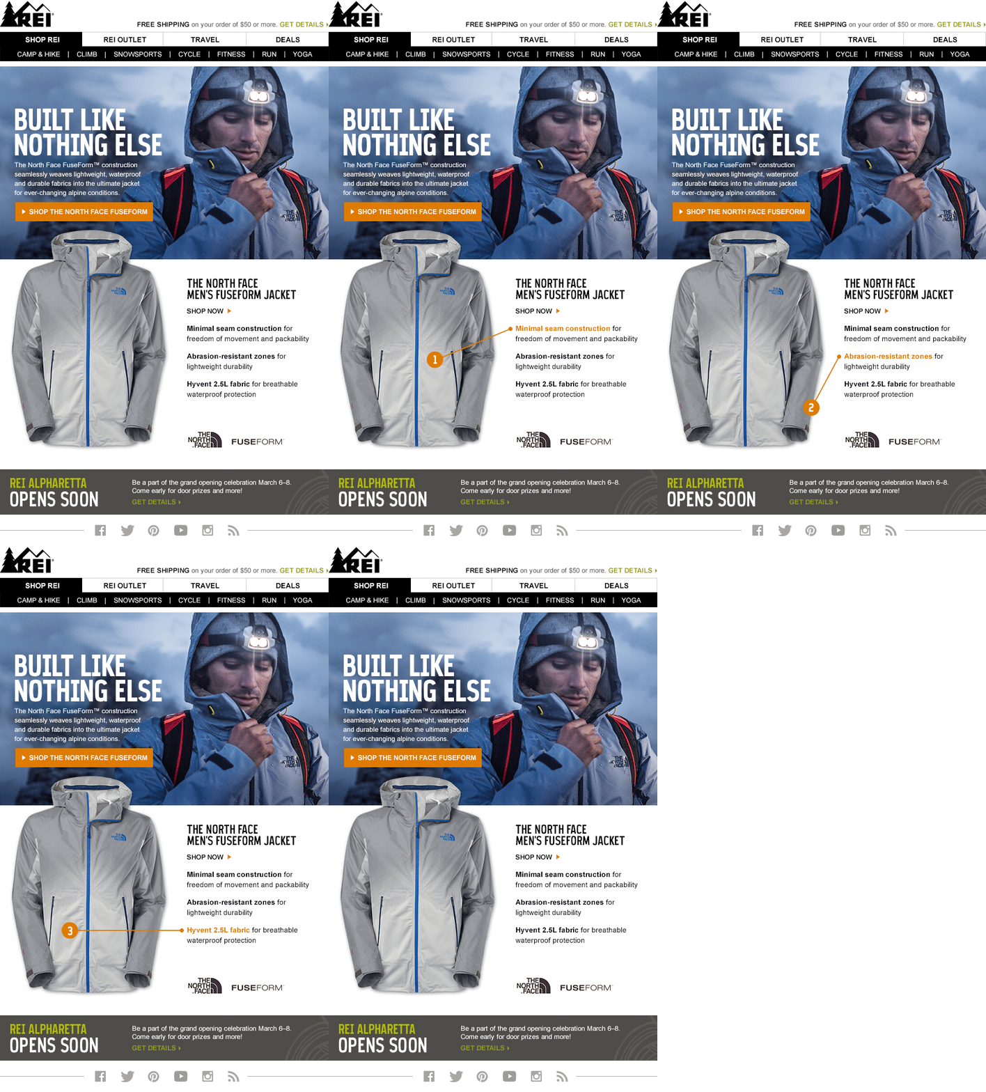
REI loves to keep things moving. This animated secondary content calls out the special features of this new jacket from North Face. The simple technique was so successful, it was frequently referenced when requesting similar treatments.

The summer of 2015 marked the start of a new, hip sub-brand at REI; evrgrn. The style was young and quirky, and made use of hand-drawn elements and critters. This email subtly brought these drawings, and the products, to life.
